일일 평균 가격
USD 기준 금액
설명
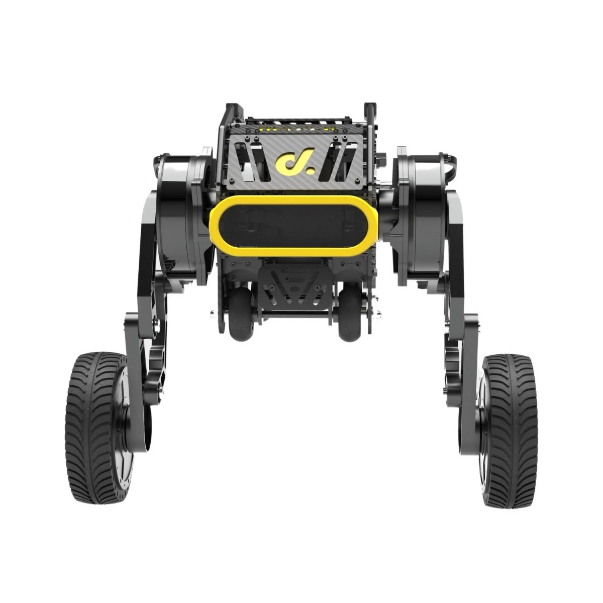
.component-container{ position: relative; font-size: 0; --item-gap-x: 13px; --item-gap-y: 0px; overflow: hidden; height: auto; } .component-container img{ width: 100%; } .component-container .item{ position: absolute; z-index: 1; font-size: 30px; line-height: 1; color: #000; width: 0; font-weight: 600; display: flex; justify-content: flex-end; } .component-container .item span{ display: block; white-space: nowrap; } .component-container .item:nth-of-type(1), .component-container .item:nth-of-type(2), .component-container .item:nth-of-type(3), .component-container .item:nth-of-type(4), .component-container .item:nth-of-type(5){ transform: translate(calc(0px - var(--item-gap-x)), var(--item-gap-y)); } .component-container .item:nth-of-type(6), .component-container .item:nth-of-type(7), .component-container .item:nth-of-type(8), .component-container .item:nth-of-type(9), .component-container .item:nth-of-type(10), .component-container .item:nth-of-type(11){ justify-content: flex-start; transform: translate(var(--item-gap-x), var(--item-gap-y)); } .item-handle{ top: 18%; left: 26.8%; } .item-mergency{ top: 22.9%; left: 28.1%; } .item-motherboard{ top: 36.3%; left: 21.7%; } .item-front{ top: 46.7%; left: 21.8%; } .item-auxiliary{ top: 63.6%; left: 20.2%; } .item-top{ top: 15%; left: 74.7%; } .item-head{ top: 33.8%; left: 74.5%; } .item-leg{ top: 40.3%; left: 74.4%; } .item-battery{ top: 45.8%; left: 79.4%; } .item-four{ top: 60.5%; left: 79.3%; } .item-wheel{ top: 84%; left: 79.5%; } .item-test{ top: calc(50% - 10vw); left: calc(50% - 28.9vw); color: red; } @media screen and (max-width: 1680px) { .component-container{ --item-gap-x-: 20px; } .component-container .item{ font-size: 29px; } } @media screen and (max-width: 1560px) { .component-container{ --item-gap-y: -1px; } .component-container .item{ font-size: 26px; } } @media screen and (max-width: 1440px) { .component-container .item{ font-size: 24px; } } @media screen and (max-width: 1366px) { .component-container{ --item-gap-x: 10px; } .component-container .item{ font-size: 22px; } } @media screen and (max-width: 1280px) { .component-container{ --item-gap-x: 8px; } .component-container .item{ font-size: 20px; } } @media screen and (max-width: 1080px) { .component-container .item{ font-size: 16px; } } @media screen and (max-width: 768px) { .component-container .item{ font-size: 12px; } } @media screen and (max-width: 750px) { .component-container{ --item-gap-x: 4px; } .component-container .item{ font-size: 8px; } .component-container .item:nth-of-type(10){ width: 60px; } .component-container .item:nth-of-type(10) span{ white-space: initial; } } @media screen and (max-width: 410px) { .component-container .item{ font-size: 7px; } } @media screen and (max-width: 375px) { .component-container .item{ font-size: 6px; } } .data-container{ position: relative; font-size: 0; --item-gap-x: 13px; --item-gap-y: 0px; overflow: hidden; } .data-m-container{ display: none; } .data-container img{ width: 100%; } .data-container .item{ position: absolute; z-index: 1; width: 0; } .item-content > div { width: 720px; font-size: 23px; line-height: 1; font-weight: 500; margin-top: 6px; color: rgb(20,23,21); white-space: pre-wrap; } .data-container .item .title { font-weight: 600; font-size: 26px; margin-top: 0px; color: rgb(37,30,30); } .item-1 .item-content > div { width: 530px; } .item-2 .item-content > div { width: 510px; } .item-3 .item-content > div { width: 510px; } .item-4 .item-content > div { width: 730px; } .item-5 .item-content > div { width: 490px; } .item-6 .item-content > div { width: 560px; } .battery{ display: flex; align-items: center; } .battery span.active{ font-size: 60px; } .data-container .item:nth-of-type(1), .data-container .item:nth-of-type(2), .data-container .item:nth-of-type(3){ transform: translate(calc(0px - var(--item-gap-x)), var(--item-gap-y)); } .data-container .item:nth-of-type(4), .data-container .item:nth-of-type(5), .data-container .item:nth-of-type(6){ justify-content: flex-start; transform: translate(var(--item-gap-x), var(--item-gap-y)); } .item-1{ top: 6.8%; left: 10.3%; } .item-2{ top: 35.2%; left: 4.9%; } .item-3{ top: 64.2%; left: 11.9%; } .item-4{ top: 9%; left: 54.2%; } .item-5{ top: 38.9%; left: 66.5%; } .item-6{ top: 70.3%; left: 65.7%; } @media screen and (max-width: 1680px) { .data-container{ --item-gap-x-: 20px; --item-gap-y: -10px; } .item-4 { left: 52.2%; } .item-6 { top: 66.3%; left: 65.7%; } .item-6 .item-content>div { width: 500px; } } @media screen and (max-width: 1560px) { .data-container{ --item-gap-y: -20px; } .data-container .item .title{ font-size: 25px; } .item-content > div{ font-size: 22px; } .item-4 .item-content>div { font-size: 21px; } } @media screen and (max-width: 1440px) { .data-container .item .title{ font-size: 23px; } .item-content > div{ font-size: 20px; } .item-5 .item-content>div { width: 440px; } .item-6 .item-content>div { width: 460px; } .item-4 .item-content>div { font-size: 19px; } } @media screen and (max-width: 1366px) { .data-container { --item-gap-y: -10px; } .data-container .item .title{ font-size: 21px; } .item-content > div{ font-size: 18px; } .item-4 .item-content>div { width: 620px; } .item-5 .item-content>div { width: 430px; } .item-6 .item-content>div { width: 340px; } .item-4 .item-content>div { font-size: 18px; } } @media screen and (max-width: 1280px) { .data-container { --item-gap-y: -30px; } .item-1 .item-content>div { width: 400px; } .item-2 .item-content>div { width: 280px; } .item-4 { left: 50.2%; } .item-4 .item-content>div { font-size: 16px; } } @media screen and (max-width: 1080px) { .data-container{ --item-gap-y: -10px; } .data-container .item .title{ font-size: 14px; } .item-content > div{ font-size: 12px; } .item-1 { top: 9.8%; } .item-4 { top: 7%; left: 52.2%; } .item-4 .item-content>div { width: 340px; font-size: 12px; } .item-5 { top: 39.9%; } .item-5 .item-content>div { width: 230px; } .item-6 { top: 66.3%; } .item-6 .item-content>div { width: 200px; } } @media screen and (max-width: 768px) { .data-container{ display: none; } .data-m-container{ display: block; } } @media screen and (max-width: 750px) { } .hidedesktop{ display: none; } .development-container{ position: relative; display: flex; min-height: 985px; max-width: 1920px; margin: 0 auto; /* background: radial-gradient(#fff 0%, #fff 30%, rgb(232,232,232)); */ } .development-container .content{ position: relative; z-index: 2; display: flex; padding-left: 74px; flex-direction: column; justify-content: center; } .development-container .content h2{ font-size: 64px; line-height: 1; color: #000; margin: 0; font-weight: 600; font-style: italic; } .platform-list{ display: flex; flex-wrap: wrap; justify-content: center; margin-top: 180px; width: 590px; align-items: center; } .platform-list .platform-item:nth-child(1){ width: 150px; } .platform-list .platform-item:nth-child(2){ width: 150px; } .platform-list .platform-item:nth-child(3){ width: 150px; } .platform-list .platform-item:nth-child(4){ width: 150px; } .platform-list .platform-item:nth-child(5){ width: 150px; } .platform-list .platform-item img{ width: 100%; } .development-container .diablo-productimg-1{ position: absolute; z-index: 1; right: 0px; bottom: 0px; width: 57.29% !important; } .diablo-productimg-m-1 img{ width: 100%; } .diablo-productimg-m-1{ display: none; } .product_point-list .product-point{ position: absolute; z-index: 1; font-size: 25px; line-height: 1; color: #000; width: 0; font-weight: 600; display: flex; color: rgb(249, 212, 34); white-space: nowrap; justify-content: flex-end; } .product_point-list .product-point:nth-of-type(1){ top: 43%; left: 20%; } .product_point-list .product-point:nth-of-type(2){ top: 21.8%; left: 93%; } .product_point-list .product-point:nth-of-type(3){ top: 74%; left: 68%; text-align: center; } @media screen and (max-width: 1680px) { .development-container .diablo-product__img-1{ width: 1000px; bottom: 120px; } .development-container .content h2{ font-size: 52px; } .product_point-list .product-point{ font-size: 24px; } } @media screen and (max-width: 1440px) { .development-container .diablo-product__img-1{ width: 860px; bottom: 140px; } .development-container .content h2{ font-size: 46px; } .platform-list{ margin-top: 140px; } .product_point-list .product-point{ font-size: 22px; } } @media screen and (max-width: 1280px) { .development-container{ min-height: 631px; } .development-container .diablo-product__img-1{ width: 860px; bottom: 0px; } .development-container .content h2{ font-size: 34px; } .platform-list{ margin-top: 60px; width: 350px; } .platform-list .platform-item:nth-child(1), .platform-list .platform-item:nth-child(2), .platform-list .platform-item:nth-child(4), .platform-list .platform-item:nth-child(5) { width: 90px; } .platform-list .platform-item:nth-child(3){ width: 130px; } .product_point-list .product-point{ font-size: 20px; } } @media screen and (max-width: 768px) { .product_point-list .product-point{ font-size: 15px; } .product_point-list .product-point:nth-of-type(2) { top: 20.4%; } } @media screen and (max-width: 768px) { .hide__desktop{ display: initial; } .development-container{ min-height: initial; } .product_point-list .product-point{ font-size: 12px; } .development-container .diablo-productimg-1{ display: none; } .diablo-productimg-m-1{ display: block; width: 80%; margin-top: 0px; } .development-container .content h2 { font-size: 26px; } .development-container .content{ padding: 30px; align-items: center; } .platform-list{ margin-top: 0px; width: 100%; } .diablo-productimg-m-1 .product-point:nth-of-type(1) { top: 36%; left: 29%; } .diablo-productimg-m-1 .product-point:nth-of-type(2) { top: 26.4%; left: 80%; justify-content: flex-start; } .diablo-product__img-m-1 .product-point:nth-of-type(3) { top: 47.4%; left: 65%; } } @media screen and (max-width: 410px) { .product_point-list .product-point{ font-size: 10px; } } .function-container { max-width: 1920px; margin: 0 auto; padding: 120px 85px; display: flex; } .function-left { width: 30%; font-size: 24px; color: rgb(254,254,254); display: flex; flex-direction: column; justify-content: space-around; } .function-left h2 { font-size: 44px; text-align: center; color: #000; margin: 0; background: linear-gradient(to bottom, transparent 0%, transparent 50%, rgb(255,211,2) 50%,rgb(255,211,2) 50%); } .function-left .content-wrapper { flex: 1; display: flex; width: 100%; padding-right: 30px; } .function-left .content { display: flex; width: 100%; flex-direction: column; padding: 30px 0 30px 30px; background: rgb(127,127,127); justify-content: space-around; } .function-left .content p { margin: 0; font-size: 36px; font-weight: 600; } .function-list { display: flex; flex-wrap: wrap; gap: 55px 50px; flex: 1; margin-left: 50px; } .function-item img { width: 100%; } .function-item { border-radius: 8px; overflow: hidden; width: calc(50% - 25px); } @media screen and (max-width: 1920px) { .function-left h2 { font-size: 40px; } .function-left .content p { font-size: 32px; } } @media screen and (max-width: 1680px) { .function-left h2 { font-size: 38px; } .function-left .content p { font-size: 30px; } } @media screen and (max-width: 1560px) { .function-left h2 { font-size: 35px; } .function-left .content p { font-size: 27px; } } @media screen and (max-width: 1440px) { .function-left h2 { font-size: 30px; } .function-left .content p { font-size: 22px; } } @media screen and (max-width: 1280px) { .function-list{ gap: 30px; } .function-left h2 { font-size: 25px; } .function-left .content p { font-size: 20px; } } @media screen and (max-width: 1000px) { .function-list{ gap: 20px; margin-left: 30px; } .function-left h2 { font-size: 16px; } .function-left .content p { font-size: 14px; } } @media screen and (max-width: 768px) { .function-container { padding: 40px 30px; align-items: center; flex-direction: column; } .function-list{ gap: 10px 0; margin: 30px 0 0 0px; flex-direction: column; } .function-left{ width: 100%; } .function-left h2 { font-size: 16px; } .function-left .content p { font-size: 12px; width: 50%; } .function-item{ width: 100%; } .function-left .content-wrapper { padding: 0; } .function-left .content { padding: 20px 10px 20px 30px; flex-direction: row; flex-wrap: wrap; justify-content: flex-start; } } @media screen and (max-width: 410px) { .function-left .content p { font-size: 10px; } } .mode-container { padding: 40px 0 100px; background: radial-gradient(#fff 0%, #fff 47%, rgb(218 218 218)); } .mode-list { display: flex; gap: 0 70px; width: 90%; max-width: 1680px; margin: 0 auto; } .mode-item { position: relative; width: calc(100% / 3); } .mode-item img { width: 100%; } .mode-item .title{ position: absolute; z-index: 2; left: 50%; color: #000; bottom: 40px; font-size: 26px; font-weight: 600; line-height: 1; white-space: nowrap; transform: translateX(-50%); } .mode-space { display: flex; width: 90%; max-width: 1566px; margin: 0px auto 0; background: rgb(238,238,238); border-top: 10px solid rgb(246,202,26); } .mode-space-column { display: flex; flex-direction: column; } .mode-space-column:first-child { width: 42%; } .mode-space-column:last-child { flex: 1; border-left: 4px solid rgb(194,194,194); } .mode-space-item { display: flex; align-items: center; justify-content: space-between; padding: 8px 32px; flex: 1; font-size: 18px; font-weight: 600; line-height: 1.1; color: rgb(134,134,134); } .mode-space-item+.mode-space-item { border-top: 4px solid rgb(194,194,194); } .mode-space-column:last-child .mode-space-value { width: 380px; } .mode-space-value { color: #000; } @media screen and (max-width: 1680px) { .mode-space-item{ font-size: 16px; } .mode-space-column:last-child .mode-space-value { width: 340px; } .mode-item .title{ font-size: 22px; } } @media screen and (max-width: 1440px) { .mode-space-item{ font-size: 15px; } .mode-space-column:last-child .mode-space-value { width: 320px; } .mode-item .title{ bottom: 30px; font-size: 18px; } } @media screen and (max-width: 1000px) { .mode-container{ display: flex; } .mode-list{ width: 29%; min-width: 150px; flex-direction: column; } .mode-item { width: 100%; } .mode-space{ flex: 1; border-top: none; margin: 0 0 0 50px; flex-direction: column; background: none; justify-content: space-around; } .mode-space-column{ background: rgb(238,238,238); border-top: 10px solid rgb(246,202,26); } .mode-space-item{ font-size: 13px; } .mode-space-column:last-child .mode-space-value { width: 270px; } .mode-space-column:first-child, .mode-space-column:last-child{ width: 100%; } .mode-space-column:last-child{ border-left: none; flex: initial; } .mode-item .title{ bottom: 20px; font-size: 14px; } @media screen and (max-width: 768px) { .mode-container { display: block; padding: 30px 0; } .mode-list { width: 100%; gap: 0 0px; flex-direction: row; } .mode-item { width: calc(100% / 3); } .mode-space{ margin: 0 auto; } .mode-space-item{ font-size: 10px; padding: 8px 10px; } .mode-space-column:last-child .mode-space-key, .mode-space-column:last-child .mode-space-value { width: 50%; } .mode-space-column:last-child .mode-space-key br, .mode-space-column:last-child .mode-space-value br { display: none; } .mode-space-column { border-top: 4px solid rgb(246,202,26); } .mode-space-item+.mode-space-item { border-top: 1px solid rgb(194,194,194); } .mode-item .title { font-size: 10px; bottom: 10px; } } @media screen and (max-width: 410px) { .mode-item .title { font-size: 9px; bottom: 6px; } } } Diablo, World‘s First Direct-Drive Self-Balancing Wheeled-Leg Robot Super agile & balanced. Diablo is the world first wheeled-leg transformable robot powered by 6 Direct-Drive Motors. An open development platform for custom controls & DIY. Super Agile & Powerful Transformable Robot Programmable & Open-Development Platform Diablo is perfect for Research and Development It comes with a microcontroller board that runs the real-time self balancing algorithms. (It has a raspberry pi that communicates with the microcontroller board and implemented the documented ROS API and can perform basic autonomous localization and navigation The cavity allows you to replace the Raspberry Pi with a more powerful computer board. There is space to add a depth camera on the front and a LIDAR on top Payload on too up to 4kg supported for additional battery, LIDAR, cameras, computers and a basic actuator. Resources ROS2 Repository Handle Emergency.Stop Motherboard Front.Sensors.Space Auxiliary.Wheels Top.Cargo.Space Head.Tilting.Motor Leg.Crouching.Motor Battery Four-bar.Linkage.Leg Wheel.Hub.Motor
.component-container{ position: relative; font-size: 0; --item-gap-x: 13px; --item-gap-y: 0px; overflow: hidden; height: auto; } .component-container img{ width: 100%; } .component-container .item{ position: absolute; z-index: 1; font-size: 30px; line-height: 1; color: #000; width: 0; font-weight: 600; display: flex; justify-content: flex-end; } .component-container .item span{ display: block; white-space: nowrap; } .component-container .item:nth-of-type(1), .component-container .item:nth-of-type(2), .component-container .item:nth-of-type(3), .component-container .item:nth-of-type(4), .component-container .item:nth-of-type(5){ transform: translate(calc(0px - var(--item-gap-x)), var(--item-gap-y)); } .component-container .item:nth-of-type(6), .component-container .item:nth-of-type(7), .component-container .item:nth-of-type(8), .component-container .item:nth-of-type(9), .component-container .item:nth-of-type(10), .component-container .item:nth-of-type(11){ justify-content: flex-start; transform: translate(var(--item-gap-x), var(--item-gap-y)); } .item-handle{ top: 18%; left: 26.8%; } .item-mergency{ top: 22.9%; left: 28.1%; } .item-motherboard{ top: 36.3%; left: 21.7%; } .item-front{ top: 46.7%; left: 21.8%; } .item-auxiliary{ top: 63.6%; left: 20.2%; } .item-top{ top: 15%; left: 74.7%; } .item-head{ top: 33.8%; left: 74.5%; } .item-leg{ top: 40.3%; left: 74.4%; } .item-battery{ top: 45.8%; left: 79.4%; } .item-four{ top: 60.5%; left: 79.3%; } .item-wheel{ top: 84%; left: 79.5%; } .item-test{ top: calc(50% - 10vw); left: calc(50% - 28.9vw); color: red; } @media screen and (max-width: 1680px) { .component-container{ --item-gap-x-: 20px; } .component-container .item{ font-size: 29px; } } @media screen and (max-width: 1560px) { .component-container{ --item-gap-y: -1px; } .component-container .item{ font-size: 26px; } } @media screen and (max-width: 1440px) { .component-container .item{ font-size: 24px; } } @media screen and (max-width: 1366px) { .component-container{ --item-gap-x: 10px; } .component-container .item{ font-size: 22px; } } @media screen and (max-width: 1280px) { .component-container{ --item-gap-x: 8px; } .component-container .item{ font-size: 20px; } } @media screen and (max-width: 1080px) { .component-container .item{ font-size: 16px; } } @media screen and (max-width: 768px) { .component-container .item{ font-size: 12px; } } @media screen and (max-width: 750px) { .component-container{ --item-gap-x: 4px; } .component-container .item{ font-size: 8px; } .component-container .item:nth-of-type(10){ width: 60px; } .component-container .item:nth-of-type(10) span{ white-space: initial; } } @media screen and (max-width: 410px) { .component-container .item{ font-size: 7px; } } @media screen and (max-width: 375px) { .component-container .item{ font-size: 6px; } } .data-container{ position: relative; font-size: 0; --item-gap-x: 13px; --item-gap-y: 0px; overflow: hidden; } .data-m-container{ display: none; } .data-container img{ width: 100%; } .data-container .item{ position: absolute; z-index: 1; width: 0; } .item-content > div { width: 720px; font-size: 23px; line-height: 1; font-weight: 500; margin-top: 6px; color: rgb(20,23,21); white-space: pre-wrap; } .data-container .item .title { font-weight: 600; font-size: 26px; margin-top: 0px; color: rgb(37,30,30); } .item-1 .item-content > div { width: 530px; } .item-2 .item-content > div { width: 510px; } .item-3 .item-content > div { width: 510px; } .item-4 .item-content > div { width: 730px; } .item-5 .item-content > div { width: 490px; } .item-6 .item-content > div { width: 560px; } .battery{ display: flex; align-items: center; } .battery span.active{ font-size: 60px; } .data-container .item:nth-of-type(1), .data-container .item:nth-of-type(2), .data-container .item:nth-of-type(3){ transform: translate(calc(0px - var(--item-gap-x)), var(--item-gap-y)); } .data-container .item:nth-of-type(4), .data-container .item:nth-of-type(5), .data-container .item:nth-of-type(6){ justify-content: flex-start; transform: translate(var(--item-gap-x), var(--item-gap-y)); } .item-1{ top: 6.8%; left: 10.3%; } .item-2{ top: 35.2%; left: 4.9%; } .item-3{ top: 64.2%; left: 11.9%; } .item-4{ top: 9%; left: 54.2%; } .item-5{ top: 38.9%; left: 66.5%; } .item-6{ top: 70.3%; left: 65.7%; } @media screen and (max-width: 1680px) { .data-container{ --item-gap-x-: 20px; --item-gap-y: -10px; } .item-4 { left: 52.2%; } .item-6 { top: 66.3%; left: 65.7%; } .item-6 .item-content>div { width: 500px; } } @media screen and (max-width: 1560px) { .data-container{ --item-gap-y: -20px; } .data-container .item .title{ font-size: 25px; } .item-content > div{ font-size: 22px; } .item-4 .item-content>div { font-size: 21px; } } @media screen and (max-width: 1440px) { .data-container .item .title{ font-size: 23px; } .item-content > div{ font-size: 20px; } .item-5 .item-content>div { width: 440px; } .item-6 .item-content>div { width: 460px; } .item-4 .item-content>div { font-size: 19px; } } @media screen and (max-width: 1366px) { .data-container { --item-gap-y: -10px; } .data-container .item .title{ font-size: 21px; } .item-content > div{ font-size: 18px; } .item-4 .item-content>div { width: 620px; } .item-5 .item-content>div { width: 430px; } .item-6 .item-content>div { width: 340px; } .item-4 .item-content>div { font-size: 18px; } } @media screen and (max-width: 1280px) { .data-container { --item-gap-y: -30px; } .item-1 .item-content>div { width: 400px; } .item-2 .item-content>div { width: 280px; } .item-4 { left: 50.2%; } .item-4 .item-content>div { font-size: 16px; } } @media screen and (max-width: 1080px) { .data-container{ --item-gap-y: -10px; } .data-container .item .title{ font-size: 14px; } .item-content > div{ font-size: 12px; } .item-1 { top: 9.8%; } .item-4 { top: 7%; left: 52.2%; } .item-4 .item-content>div { width: 340px; font-size: 12px; } .item-5 { top: 39.9%; } .item-5 .item-content>div { width: 230px; } .item-6 { top: 66.3%; } .item-6 .item-content>div { width: 200px; } } @media screen and (max-width: 768px) { .data-container{ display: none; } .data-m-container{ display: block; } } @media screen and (max-width: 750px) { } .hidedesktop{ display: none; } .development-container{ position: relative; display: flex; min-height: 985px; max-width: 1920px; margin: 0 auto; /* background: radial-gradient(#fff 0%, #fff 30%, rgb(232,232,232)); */ } .development-container .content{ position: relative; z-index: 2; display: flex; padding-left: 74px; flex-direction: column; justify-content: center; } .development-container .content h2{ font-size: 64px; line-height: 1; color: #000; margin: 0; font-weight: 600; font-style: italic; } .platform-list{ display: flex; flex-wrap: wrap; justify-content: center; margin-top: 180px; width: 590px; align-items: center; } .platform-list .platform-item:nth-child(1){ width: 150px; } .platform-list .platform-item:nth-child(2){ width: 150px; } .platform-list .platform-item:nth-child(3){ width: 150px; } .platform-list .platform-item:nth-child(4){ width: 150px; } .platform-list .platform-item:nth-child(5){ width: 150px; } .platform-list .platform-item img{ width: 100%; } .development-container .diablo-productimg-1{ position: absolute; z-index: 1; right: 0px; bottom: 0px; width: 57.29% !important; } .diablo-productimg-m-1 img{ width: 100%; } .diablo-productimg-m-1{ display: none; } .product_point-list .product-point{ position: absolute; z-index: 1; font-size: 25px; line-height: 1; color: #000; width: 0; font-weight: 600; display: flex; color: rgb(249, 212, 34); white-space: nowrap; justify-content: flex-end; } .product_point-list .product-point:nth-of-type(1){ top: 43%; left: 20%; } .product_point-list .product-point:nth-of-type(2){ top: 21.8%; left: 93%; } .product_point-list .product-point:nth-of-type(3){ top: 74%; left: 68%; text-align: center; } @media screen and (max-width: 1680px) { .development-container .diablo-product__img-1{ width: 1000px; bottom: 120px; } .development-container .content h2{ font-size: 52px; } .product_point-list .product-point{ font-size: 24px; } } @media screen and (max-width: 1440px) { .development-container .diablo-product__img-1{ width: 860px; bottom: 140px; } .development-container .content h2{ font-size: 46px; } .platform-list{ margin-top: 140px; } .product_point-list .product-point{ font-size: 22px; } } @media screen and (max-width: 1280px) { .development-container{ min-height: 631px; } .development-container .diablo-product__img-1{ width: 860px; bottom: 0px; } .development-container .content h2{ font-size: 34px; } .platform-list{ margin-top: 60px; width: 350px; } .platform-list .platform-item:nth-child(1), .platform-list .platform-item:nth-child(2), .platform-list .platform-item:nth-child(4), .platform-list .platform-item:nth-child(5) { width: 90px; } .platform-list .platform-item:nth-child(3){ width: 130px; } .product_point-list .product-point{ font-size: 20px; } } @media screen and (max-width: 768px) { .product_point-list .product-point{ font-size: 15px; } .product_point-list .product-point:nth-of-type(2) { top: 20.4%; } } @media screen and (max-width: 768px) { .hide__desktop{ display: initial; } .development-container{ min-height: initial; } .product_point-list .product-point{ font-size: 12px; } .development-container .diablo-productimg-1{ display: none; } .diablo-productimg-m-1{ display: block; width: 80%; margin-top: 0px; } .development-container .content h2 { font-size: 26px; } .development-container .content{ padding: 30px; align-items: center; } .platform-list{ margin-top: 0px; width: 100%; } .diablo-productimg-m-1 .product-point:nth-of-type(1) { top: 36%; left: 29%; } .diablo-productimg-m-1 .product-point:nth-of-type(2) { top: 26.4%; left: 80%; justify-content: flex-start; } .diablo-product__img-m-1 .product-point:nth-of-type(3) { top: 47.4%; left: 65%; } } @media screen and (max-width: 410px) { .product_point-list .product-point{ font-size: 10px; } } .function-container { max-width: 1920px; margin: 0 auto; padding: 120px 85px; display: flex; } .function-left { width: 30%; font-size: 24px; color: rgb(254,254,254); display: flex; flex-direction: column; justify-content: space-around; } .function-left h2 { font-size: 44px; text-align: center; color: #000; margin: 0; background: linear-gradient(to bottom, transparent 0%, transparent 50%, rgb(255,211,2) 50%,rgb(255,211,2) 50%); } .function-left .content-wrapper { flex: 1; display: flex; width: 100%; padding-right: 30px; } .function-left .content { display: flex; width: 100%; flex-direction: column; padding: 30px 0 30px 30px; background: rgb(127,127,127); justify-content: space-around; } .function-left .content p { margin: 0; font-size: 36px; font-weight: 600; } .function-list { display: flex; flex-wrap: wrap; gap: 55px 50px; flex: 1; margin-left: 50px; } .function-item img { width: 100%; } .function-item { border-radius: 8px; overflow: hidden; width: calc(50% - 25px); } @media screen and (max-width: 1920px) { .function-left h2 { font-size: 40px; } .function-left .content p { font-size: 32px; } } @media screen and (max-width: 1680px) { .function-left h2 { font-size: 38px; } .function-left .content p { font-size: 30px; } } @media screen and (max-width: 1560px) { .function-left h2 { font-size: 35px; } .function-left .content p { font-size: 27px; } } @media screen and (max-width: 1440px) { .function-left h2 { font-size: 30px; } .function-left .content p { font-size: 22px; } } @media screen and (max-width: 1280px) { .function-list{ gap: 30px; } .function-left h2 { font-size: 25px; } .function-left .content p { font-size: 20px; } } @media screen and (max-width: 1000px) { .function-list{ gap: 20px; margin-left: 30px; } .function-left h2 { font-size: 16px; } .function-left .content p { font-size: 14px; } } @media screen and (max-width: 768px) { .function-container { padding: 40px 30px; align-items: center; flex-direction: column; } .function-list{ gap: 10px 0; margin: 30px 0 0 0px; flex-direction: column; } .function-left{ width: 100%; } .function-left h2 { font-size: 16px; } .function-left .content p { font-size: 12px; width: 50%; } .function-item{ width: 100%; } .function-left .content-wrapper { padding: 0; } .function-left .content { padding: 20px 10px 20px 30px; flex-direction: row; flex-wrap: wrap; justify-content: flex-start; } } @media screen and (max-width: 410px) { .function-left .content p { font-size: 10px; } } .mode-container { padding: 40px 0 100px; background: radial-gradient(#fff 0%, #fff 47%, rgb(218 218 218)); } .mode-list { display: flex; gap: 0 70px; width: 90%; max-width: 1680px; margin: 0 auto; } .mode-item { position: relative; width: calc(100% / 3); } .mode-item img { width: 100%; } .mode-item .title{ position: absolute; z-index: 2; left: 50%; color: #000; bottom: 40px; font-size: 26px; font-weight: 600; line-height: 1; white-space: nowrap; transform: translateX(-50%); } .mode-space { display: flex; width: 90%; max-width: 1566px; margin: 0px auto 0; background: rgb(238,238,238); border-top: 10px solid rgb(246,202,26); } .mode-space-column { display: flex; flex-direction: column; } .mode-space-column:first-child { width: 42%; } .mode-space-column:last-child { flex: 1; border-left: 4px solid rgb(194,194,194); } .mode-space-item { display: flex; align-items: center; justify-content: space-between; padding: 8px 32px; flex: 1; font-size: 18px; font-weight: 600; line-height: 1.1; color: rgb(134,134,134); } .mode-space-item+.mode-space-item { border-top: 4px solid rgb(194,194,194); } .mode-space-column:last-child .mode-space-value { width: 380px; } .mode-space-value { color: #000; } @media screen and (max-width: 1680px) { .mode-space-item{ font-size: 16px; } .mode-space-column:last-child .mode-space-value { width: 340px; } .mode-item .title{ font-size: 22px; } } @media screen and (max-width: 1440px) { .mode-space-item{ font-size: 15px; } .mode-space-column:last-child .mode-space-value { width: 320px; } .mode-item .title{ bottom: 30px; font-size: 18px; } } @media screen and (max-width: 1000px) { .mode-container{ display: flex; } .mode-list{ width: 29%; min-width: 150px; flex-direction: column; } .mode-item { width: 100%; } .mode-space{ flex: 1; border-top: none; margin: 0 0 0 50px; flex-direction: column; background: none; justify-content: space-around; } .mode-space-column{ background: rgb(238,238,238); border-top: 10px solid rgb(246,202,26); } .mode-space-item{ font-size: 13px; } .mode-space-column:last-child .mode-space-value { width: 270px; } .mode-space-column:first-child, .mode-space-column:last-child{ width: 100%; } .mode-space-column:last-child{ border-left: none; flex: initial; } .mode-item .title{ bottom: 20px; font-size: 14px; } @media screen and (max-width: 768px) { .mode-container { display: block; padding: 30px 0; } .mode-list { width: 100%; gap: 0 0px; flex-direction: row; } .mode-item { width: calc(100% / 3); } .mode-space{ margin: 0 auto; } .mode-space-item{ font-size: 10px; padding: 8px 10px; } .mode-space-column:last-child .mode-space-key, .mode-space-column:last-child .mode-space-value { width: 50%; } .mode-space-column:last-child .mode-space-key br, .mode-space-column:last-child .mode-space-value br { display: none; } .mode-space-column { border-top: 4px solid rgb(246,202,26); } .mode-space-item+.mode-space-item { border-top: 1px solid rgb(194,194,194); } .mode-item .title { font-size: 10px; bottom: 10px; } } @media screen and (max-width: 410px) { .mode-item .title { font-size: 9px; bottom: 6px; } } } Diablo, World‘s First Direct-Drive Self-Balancing Wheeled-Leg Robot Super agile & balanced. Diablo is the world first wheeled-leg transformable robot powered by 6 Direct-Drive Motors. An open development platform for custom controls & DIY. Super Agile & Powerful Transformable Robot Programmable & Open-Development Platform Diablo is perfect for Research and Development It comes with a microcontroller board that runs the real-time self balancing algorithms. (It has a raspberry pi that communicates with the microcontroller board and implemented the documented ROS API and can perform basic autonomous localization and navigation The cavity allows you to replace the Raspberry Pi with a more powerful computer board. There is space to add a depth camera on the front and a LIDAR on top Payload on too up to 4kg supported for additional battery, LIDAR, cameras, computers and a basic actuator. Resources ROS2 Repository Handle Emergency.Stop Motherboard Front.Sensors.Space Auxiliary.Wheels Top.Cargo.Space Head.Tilting.Motor Leg.Crouching.Motor Battery Four-bar.Linkage.Leg Wheel.Hub.Motor
가격 변동 내역
관측 날짜별로 평균한 일일 데이터 포인트 하나를 표시합니다.
USD 기준 금액
기록된 모든 상품 가격을 협정 세계시 기준 날짜별로 평균합니다.
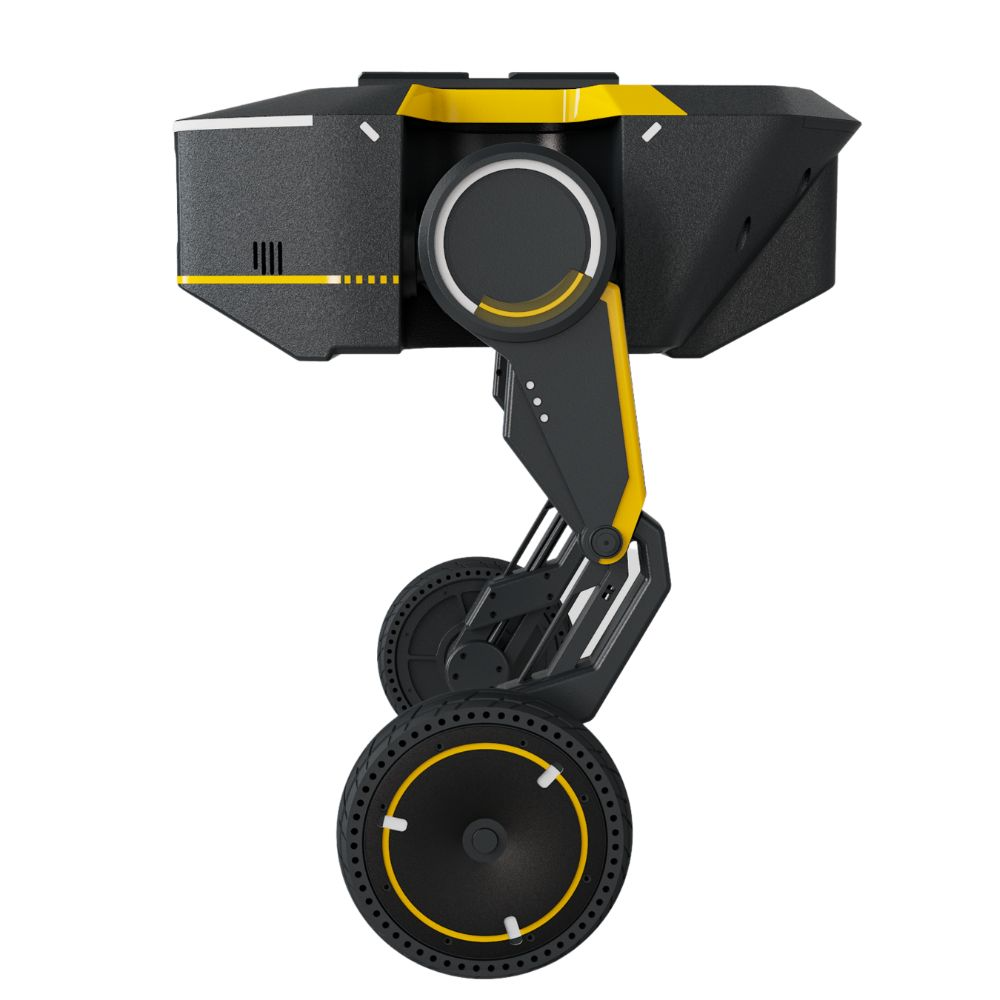
Direct Drive Tech
£10,650
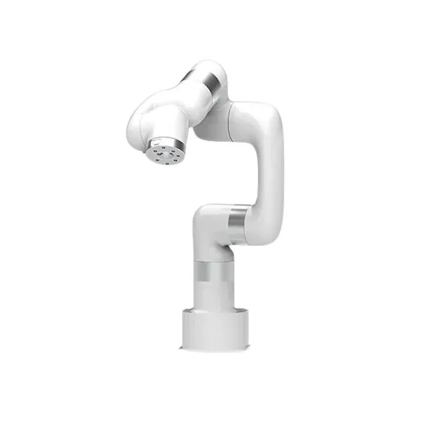
Unitree
3,600 €
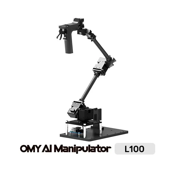
Robotis
3,291.60 €
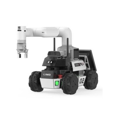
AgileX
£3,552.75
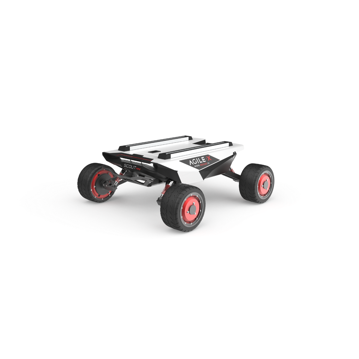
AgileX
£3,947.50
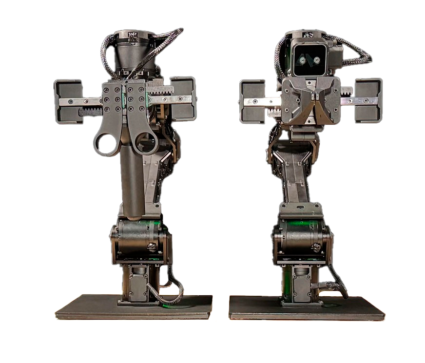
Trossen Robotics
£3,840
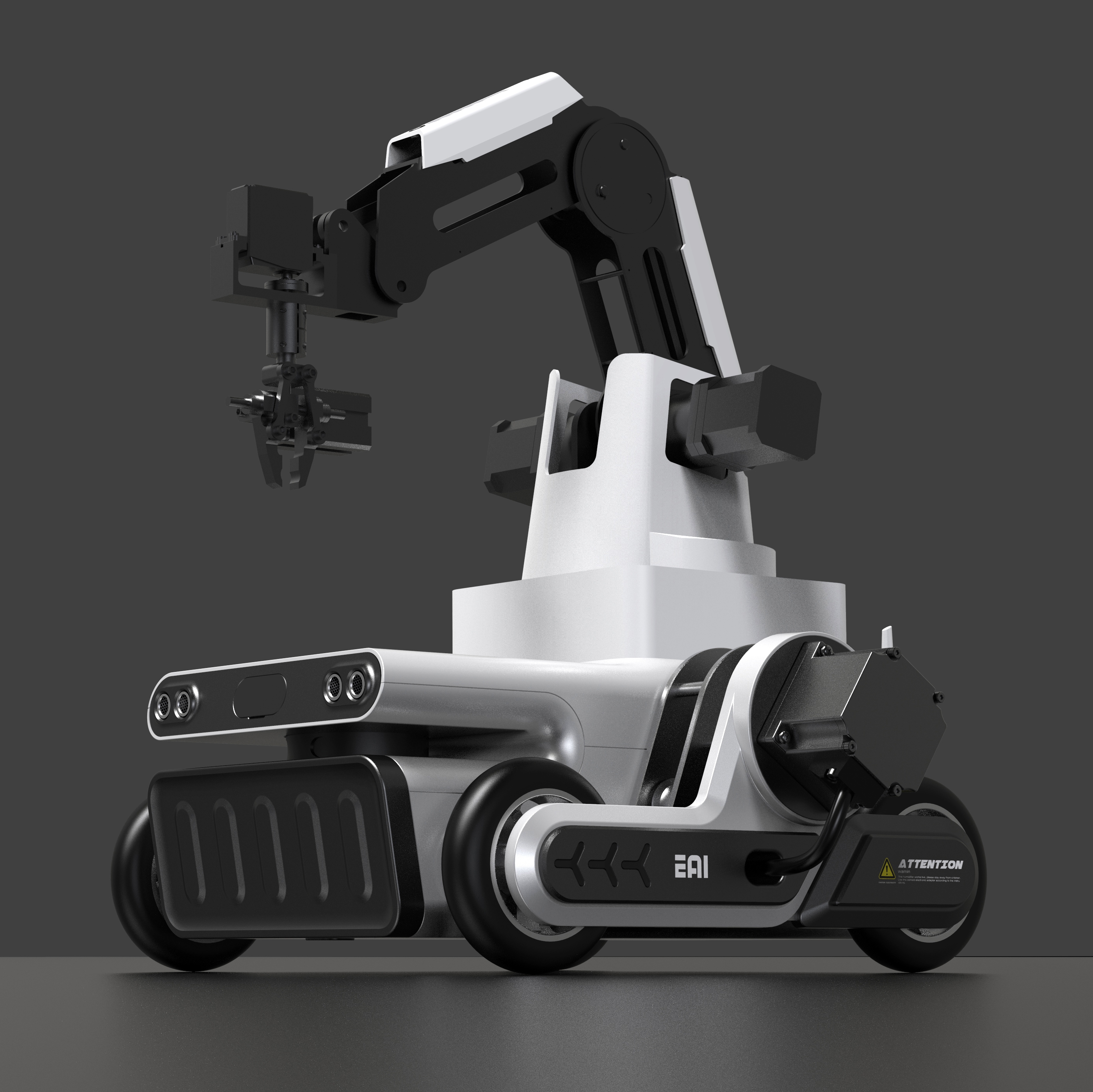
YDLIDAR
£3,630.92
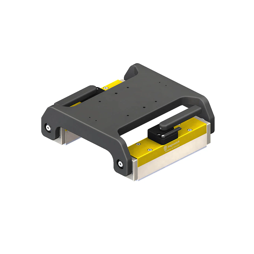
Magswitch
3,438.75 €

Elephant Robotics
2,990 zł부터

DRONELINE Drohnen & Roboter
4,080 €

Clearpath
2,976 €
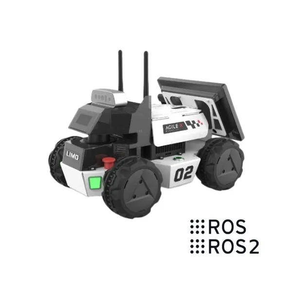
AgileX
2,694.68 €
🍪 쿠키 설정
성능 측정을 위해 쿠키를 사용합니다. 개인정보 처리방침